

Improve Your Data Display with a Reusable Table Component in React
Let's build a table component that is visually appealing, robust, efficient, and consistent across your application.


Introduction
Tables are a powerful tool for presenting data in an organized and structured way, with rows and columns that allow users to easily make sense of the content. Each cell (field) represents a data item; columns represent record types; and rows provide information on related records. Tables also offer various operations such as filtering, sorting, pagination, and searching, making them highly versatile for displaying data to users.
However, building a reusable table component in React can be challenging. It requires following best practices, considering usability and accessibility, and ensuring the component is flexible enough to meet UI requirements and effectively display data.
In this article, we will embark on a journey to build a reusable React table component using TanStack Table, a popular headless UI for building tables and data grids with complete control over your markup and styles. Additionally, we will be using Tailwind CSS to style our table component. Let's dive in!
What to expect
In this article, we will be building a table component with the following features:
Pagination
Searching
Sorting
Are you ready? Open your React + Tailwind project and walk with me on this journey to super-change how you render your tables.
Prerequisites
To follow along, you should have the following prerequisites:
Familiarity with React functional component
A React + Tailwind project
Basic knowledge of Tailwind CSS
Installation
To get started, you need to install the following using npm or yarn:
Using npm, run:
npm install @tanstack/react-table @tanstack/match-sorter-utils use-debounce
or using yarn, run:
yarn install @tanstack/react-table @tanstack/match-sorter-utils use-debounce
The command above would install:
TanStack table package,
A plugin, match-sorter-utils, which we would use later on in the tutorial to handle sorting,
Use-debounce, which we would use for our search input box.
Table component
Create a Table.js file in your components directory or however your project is structured. In this tutorial, we'll stick to components/Table.js. Add the following code to create a basic table component:
// components/Table.js

import React, { useMemo } from "react";
import {
  useReactTable,
  getCoreRowModel,
  flexRender
} from "@tanstack/react-table";

export const Table = ({ data: tableData, columns: tableColumns, title }) => {
  const data = useMemo(() => tableData, [tableData]);
  const columns = useMemo(() => tableColumns, [tableColumns]);

  const table = useReactTable({
    data,
    columns,
    getCoreRowModel: getCoreRowModel()
  });

  return (
    <div>
      <div>{title && <h3>{title}</h3>}</div>{" "}
      <table>
        <thead>
          {table.getHeaderGroups().map((headerGroup) => (
            <tr key={headerGroup.id}>
              {headerGroup.headers.map((header) => {
                return (
                  <th key={header.id} colSpan={header.colSpan} scope="col">
                    {header.isPlaceholder ? null : (
                      <div>
                        <span>
                          {flexRender(
                            header.column.columnDef.header,
                            header.getContext()
                          )}
                        </span>
                      </div>
                    )}
                  </th>
                );
              })}
            </tr>
          ))}
        </thead>
        <tbody>
          {table.getRowModel().rows.map((row) => {
            return (
              <tr key={row.id}>
                {row.getVisibleCells().map((cell) => {
                  return (
                    <td key={cell.id}>
                      {flexRender(
                        cell.column.columnDef.cell,
                        cell.getContext()
                      )}
                    </td>
                  );
                })}
              </tr>
            );
          })}
        </tbody>
      </table>
    </div>
  );
};
Our Table component takes 3 props, data, columns, and title to generate a table based on the provided data and columns. The title is the name that denotes what our table represents.
Let's go through the code step by step:
The
useMemohook is used to memoize thedataandcolumnsprops (renamed to tableData and tableColumns respectively), which helps optimize performance by preventing unnecessary recalculations of these values on every render.The
useReactTablehook from thetanstack/react-tablelibrary is called with an object containingdata,columns, andgetCoreRowModelproperties.dataandcolumnsare passed from the memoized props, whilegetCoreRowModelis a function provided by the tanstack/react-table library that is used as a callback function in the useReactTable hook to determine how the rows in the table should be modeled. By providing a custom getCoreRowModel function, we can define the structure of the row model and add additional properties or methods to the row objects as needed, allowing us to extend the functionality of the table and customize its behavior to suit our needs.The
tableobject returned by useReactTable is an instance that we can use to retrieve the header groups and rows for rendering the table.Inside the
thead, thetable.getHeaderGroups()method is called to get an array of header groups. Inside eachtr, theheaderGroup.headersproperty is mapped over to render the table headers (thelements). The header text is rendered usingflexRenderfunction from tanstack/react-table, passing in theheader.column.columnDef.headerandheader.getContext()values.Inside the
tbody, thetable.getRowModel().rowsproperty is mapped over to render the table rows (trelements). For each row, therow.getVisibleCells()method is called to get an array of visible cells, and for each cell, atdelement is rendered with a unique key attribute based on the id property of the cell. The cell content is rendered usingflexRenderfunction, passing in thecell.column.columnDef.cellandcell.getContext()values.
Using the basic component
Now, let's make use of our Table component. To do so, open your App.js file and add the following code:
// App.js

import { Table } from "./components/Table";
import { createColumnHelper } from "@tanstack/react-table";

const users = [
  {
    firstName: "Tanner",
    lastName: "Linsley",
    age: 24,
    visits: 100,
    status: "Active",
    progress: 50
  },
  {
    firstName: "Tandy",
    lastName: "Miller",
    age: 40,
    visits: 40,
    status: "Inactive",
    progress: 80
  },
  {
    firstName: "Joe",
    lastName: "Dirte",
    age: 45,
    visits: 20,
    status: "Active",
    progress: 10
  }
// You can add more records
];


const columnHelper = createColumnHelper();

const columns = [
  columnHelper.accessor("firstName", {
    cell: (info) => <b>{info.getValue()}</b>,
    header: () => <span>First Name</span>
  }),
  columnHelper.accessor("lastName", {
    cell: (info) => <b>{info.getValue()}</b>,
    header: () => <span>Last Name</span>
  }),
  columnHelper.accessor("age", {
    header: () => "Age",
    cell: (info) => info.renderValue()
  }),
  columnHelper.accessor("visits", {
    header: () => <span>Visits</span>
  }),
  columnHelper.accessor("status", {
    header: "Status"
  }),
  columnHelper.accessor("progress", {
    header: "Profile Progress"
  })
];

export default function App() {
  return (
    <div className="px-10">
      <Table data={users} columns={columns} title="User List" />
    </div>
  );
}
Great! Let's go through the code step by step:
We defined an array of objects,
users, which contains the information that we want to display in our table.The
createColumnHelperfunction is then used to create acolumnHelperobject, which provides helper functions for defining columns for the table. This object can be used to create column definitions with custom behavior and appearance.The
columnsvariable is an array of column definitions for the table. Each column definition is created using thecolumnHelper.accessorfunction, which takes a column accessor (either a string representing the property name of the data or a function that returns the desired value from the data) and an object that defines the behavior and appearance of the column.With each
column, we can define and customize it to our taste. We can define the header title that would be used inthead, and we can also customize how the data would be displayed in a cell. For example, we can further customize theStatuscolumn to define itsCellrenderer to display the desired content in the table. This allows us to have full control over the appearance and behavior of the table columns according to our requirements.
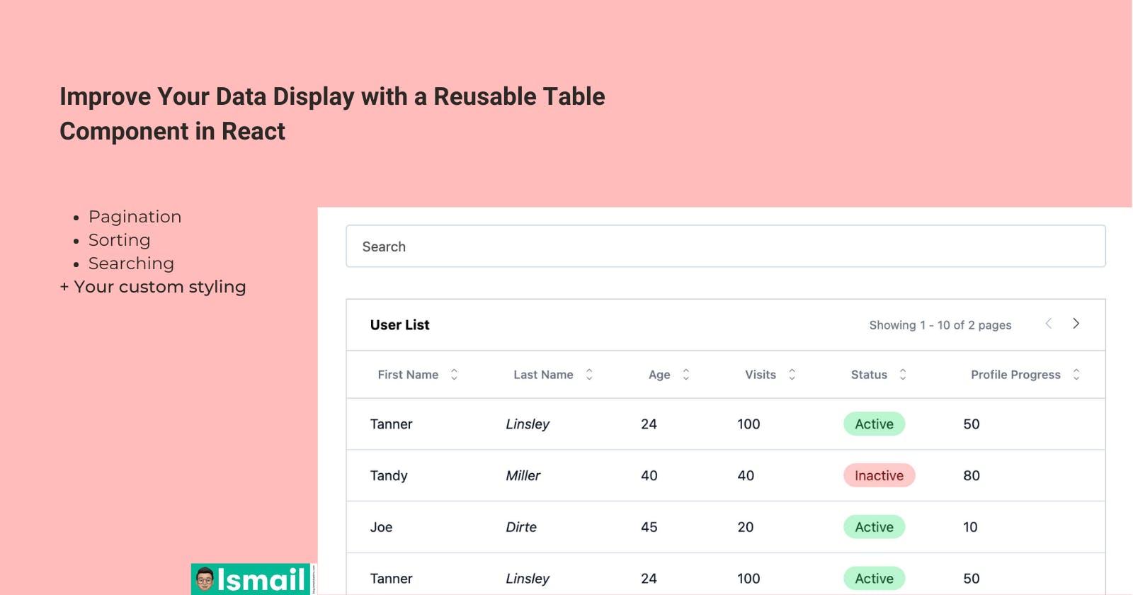
Our table should look like this.
Great job! If your table looks like the one in the sandbox above, you've made great progress!
Take a break because we are about to super-change our component.
The final result
Let's add more features and style our component with Tailwind classes.
Feel free to interact with this embedded iframe.
First, go back to App.js file and update the column array to the following.
// App.js

const columns = [
  columnHelper.accessor("firstName", {
    cell: (info) => info.getValue(),
    header: () => <span>First Name</span>,
  }),
  columnHelper.accessor("lastName",  {
    cell: (info) => <i>{info.getValue()}</i>,
    header: () => <span>Last Name</span>,
  }),
  columnHelper.accessor("age", {
    header: () => "Age",
    cell: (info) => info.renderValue(),
  }),
  columnHelper.accessor("visits", {
    header: () => <span>Visits</span>,
  }),
  columnHelper.accessor("status", {
    cell: (info) => (
<span className={`py-1 px-3 rounded-full text-sm ${info.getValue().toLowerCase() === "active" ? "bg-green-200 text-green-900" : "bg-red-200 text-red-900"}`}>
          {info.getValue()}{" "}
        </span>
),
    header: "Status",
  }),
  columnHelper.accessor("progress", {
    header: "Profile Progress",
  }),
];
We have updated the status column to show active or inactive badge using Tailwind classes.
** Debounced Search input **
For our search filter box, we need to create another file inside the components directory. Let's call it DebouncedInput.js. This component will make use of use-debounce package that we installed earlier at the beginning of the tutorial. Our DebouncedInput component is used to optimize the performance of the onChange callback function that is invoked whenever the input value changes. Instead of immediately invoking the onChange callback for every single input change event, the debounced version of the callback is invoked only after a certain amount of time has passed since the last input change event.
Copy and paste the following code:
// components/DebouncedInput.js

import { useState, useMemo } from "react";
import { useDebouncedCallback } from "use-debounce";

export const DebouncedInput = ({
  value: initialValue,
  onChange,
  debounce = 500,
  leftIcon,
  ...props
}) => {
  const [value, setValue] = useState(initialValue || "");
  const debouncedCallback = useDebouncedCallback(
    (value) => onChange(value),
    debounce
  );

  useMemo(() => setValue(initialValue), [initialValue]);

  return (
    <div className="py-3">
      <input
        value={value}
        onChange={(e) => {
          setValue(e.target.value);
          debouncedCallback(e.target.value);
        }}
        className="mt-2 outline-0 focus:outline-1   placeholder-[#515151] text-gray-600 block w-full h-11  text-sm rounded p-2  border border-slate-300 px-4"
        {...props}
      />
    </div>
  );
};
This is the updated Table component
// components/Table.js
import React, { useState, useMemo } from "react";
import {
useReactTable,
getCoreRowModel,
getFilteredRowModel,
getPaginationRowModel,
getSortedRowModel,
flexRender,
getFacetedRowModel,
getFacetedUniqueValues,
getFacetedMinMaxValues,
} from "@tanstack/react-table";
import { rankItem } from "@tanstack/match-sorter-utils";
import { DebouncedInput } from "./DebouncedInput";
const fuzzyFilter = (row, columnId, value, addMeta) => {
// Rank the item
const itemRank = rankItem(row.getValue(columnId), value);
// Store the itemRank info
addMeta({
itemRank,
});
// Return if the item should be filtered in/out
return itemRank.passed;
};
export const Table = ({
data: tableData,
columns: tableColumns,
title,
searchable = true,
searchPlaceholder = "Search",
isLoading = false,
}) => {
const [globalFilter, setGlobalFilter] = useState("");
const data = useMemo(() => tableData, [tableData]);
const columns = useMemo(() => tableColumns, [tableColumns]);
const table = useReactTable({
data,
columns,
filterFns: {
fuzzy: fuzzyFilter,
},
state: {
globalFilter,
},
onGlobalFilterChange: setGlobalFilter,
globalFilterFn: fuzzyFilter,
getCoreRowModel: getCoreRowModel(),
getFilteredRowModel: getFilteredRowModel(),
getSortedRowModel: getSortedRowModel(),
getPaginationRowModel: getPaginationRowModel(),
getFacetedRowModel: getFacetedRowModel(),
getFacetedUniqueValues: getFacetedUniqueValues(),
getFacetedMinMaxValues: getFacetedMinMaxValues(),
});
const pageIndex = table.getState().pagination.pageIndex;
const pageSize = table.getState().pagination.pageSize;
const rowsPerPage = table.getRowModel().rows.length;
// Calculate the current range of records being displayed
const startIndex = useMemo(() => pageIndex * pageSize, [pageIndex, pageSize]);
const endIndex = useMemo(
() => startIndex + (rowsPerPage || 1 - 1),
[startIndex, rowsPerPage]
);
return (
<div className="flex flex-col">
<div
className={`overflow-hidden sm:-mx-6 lg:-mx-8 ${
!searchable && "mt-6"
}`}
>
<div className="align-middle inline-block w-full sm:px-6 lg:px-8">
{searchable && (
<div className="py-5">
{isLoading && (
<div className="w-full py-3">
<div className="relative animate-pulse flex items-center justify-between">
<div className="h-10 w-full bg-gray-200 rounded"></div>
</div>
</div>
)}
{!isLoading && (
<div className="w-full">
<div className="relative rounded-md">
<DebouncedInput
value={globalFilter ?? ""}
onChange={(value) => setGlobalFilter(String(value))}
placeholder={searchPlaceholder}
/>
</div>
</div>
)}
</div>
)}
<div
className={`bg-white border-[#D4D4D8] border px-6 py-4 whitespace-nowrap flex ${
title ? "justify-between" : "justify-end"
}`}
>
<div>{title && <h3 className="text-sm font-bold">{title}</h3>}</div>
{!isLoading && table.getPageCount() > 0 && (
<div className="text-xs text-gray-500 flex gap-8 items-center justify-between">
<span className="flex items-center gap-1">
<div>Showing</div>
{startIndex + 1} - {endIndex} of {table.getPageCount()}{" "}
{table.getPageCount() > 1 ? "pages" : "page"}
</span>
{(table.getCanPreviousPage() || table.getCanNextPage()) && (
<div>
<button
className={` ${
table.getCanPreviousPage()
? "text-black"
: "text-[#9CA3AF]"
} `}
onClick={() => table.previousPage()}
disabled={!table.getCanPreviousPage()}
>
<svg
stroke="currentColor"
fill="currentColor"
strokeWidth="0"
version="1.1"
viewBox="0 0 17 17"
height="1em"
width="1em"
xmlns="http://www.w3.org/2000/svg"
>
<g></g>
<path d="M5.207 8.471l7.146 7.147-0.707 0.707-7.853-7.854 7.854-7.853 0.707 0.707-7.147 7.146z"></path>
</svg>
</button>
<button
className={`ml-4 ${
table.getCanNextPage() ? "text-black" : "text-[#9CA3AF]"
} `}
onClick={() => table.nextPage()}
disabled={!table.getCanNextPage()}
>
<svg
stroke="currentColor"
fill="currentColor"
strokeWidth="0"
version="1.1"
viewBox="0 0 17 17"
height="1em"
width="1em"
xmlns="http://www.w3.org/2000/svg"
>
<g></g>
<path d="M13.207 8.472l-7.854 7.854-0.707-0.707 7.146-7.146-7.146-7.148 0.707-0.707 7.854 7.854z"></path>
</svg>
</button>
</div>
)}
</div>
)}
</div>
<div className="overflow-auto w-full border border-[#D4D4D8] border-t-0">
<table className="w-full divide-y divide-[#D4D4D8]">
<thead className="bg-white bg-white divide-y divide-[#D2E1EF] border-t-0">
{table.getHeaderGroups().map((headerGroup) => (
<tr key={headerGroup.id}>
{headerGroup.headers.map((header) => {
return (
<th
key={header.id}
colSpan={header.colSpan}
scope="col"
className="px-6 py-4 text-left text-xs font-medium text-gray-500"
>
{header.isPlaceholder ? null : (
<button
{...{
className: header.column.getCanSort()
? "cursor-pointer select-none"
: "",
onClick:
header.column.getToggleSortingHandler(),
}}
>
<div className="flex items-center">
<span className="ml-2">
{flexRender(
header.column.columnDef.header,
header.getContext()
)}
</span>
{/* sort icons */}
{header.column.getCanSort() && (
<div className="flex flex-col ml-3">
{{
asc: (
<svg
className="w-2 h-2 "
fill="none"
stroke="currentColor"
viewBox="0 0 24 24"
xmlns="http://www.w3.org/2000/svg"
>
<path
strokeLinecap="round"
strokeLinejoin="round"
strokeWidth="2"
d="M5 15l7-7 7 7"
></path>
</svg>
),
desc: (
<svg
className="w-2 h-2"
fill="none"
stroke="currentColor"
viewBox="0 0 24 24"
xmlns="http://www.w3.org/2000/svg"
>
<path
strokeLinecap="round"
strokeLinejoin="round"
strokeWidth="2"
d="M19 9l-7 7-7-7"
></path>
</svg>
),
}[header.column.getIsSorted()] ?? (
<>
{" "}
<svg
className="w-2 h-2 "
fill="none"
stroke="currentColor"
viewBox="0 0 24 24"
xmlns="http://www.w3.org/2000/svg"
>
<path
strokeLinecap="round"
strokeLinejoin="round"
strokeWidth="2"
d="M5 15l7-7 7 7"
></path>
</svg>
<svg
className="w-2 h-2"
fill="none"
stroke="currentColor"
viewBox="0 0 24 24"
xmlns="http://www.w3.org/2000/svg"
>
<path
strokeLinecap="round"
strokeLinejoin="round"
strokeWidth="2"
d="M19 9l-7 7-7-7"
></path>
</svg>
</>
)}
</div>
)}
</div>
</button>
)}
</th>
);
})}
</tr>
))}
</thead>
<tbody className="bg-white divide-y divide-[#D2E1EF]">
{/* if isLoading, use skeleton rows */}
{isLoading &&
[...Array(5)].map((_, i) => (
<tr key={i} className="hover:bg-gray-100">
{table.getHeaderGroups()[0].headers.map((header) => {
return (
<td
key={header.id}
colSpan={header.colSpan}
className="px-6 py-4 whitespace-nowrap"
>
<div className="flex items-center w-full">
<div className="text-sm text-gray-900 w-full">
<TdSkeleton />
</div>
</div>
</td>
);
})}
</tr>
))}
{!isLoading &&
table.getRowModel().rows.map((row) => {
return (
<tr key={row.id} className="hover:bg-gray-100">
{row.getVisibleCells().map((cell) => {
return (
<td
key={cell.id}
className="px-6 py-4 whitespace-nowrap"
>
<div className="flex items-center">
<div className="text-sm text-gray-900">
{flexRender(
cell.column.columnDef.cell,
cell.getContext()
)}
</div>
</div>
</td>
);
})}
</tr>
);
})}
</tbody>
</table>
</div>
</div>
</div>
</div>
);
};
const TdSkeleton = () => {
return (
<div className="w-full h-full">
<div className="w-full h-5 bg-gray-200 animate-pulse"></div>
</div>
);
};
Let's explain the features of the updated table component in detail:
Global Filtering (Searching)
The updated table component now supports global filtering or searching across all columns. It uses a fuzzy filter function to match the search value with the values in the table rows. The fuzzy filter ranks the rows based on their similarity to the search value and only displays the rows that pass the ranking criteria.
Sorting
The table component now supports the sorting of columns. It uses a sorting function to sort the rows based on the values in the clicked column. When the header item (each column) is clicked, we call header.column.getToggleSortingHandler() to sort the data on our table-based, which toggles the sorting in ascending or descending order.
Pagination
The table component now supports client-side pagination, allowing users to navigate through large datasets easily. It displays a specific number of rows per page and provides buttons to move to the previous or next page of data. It also shows the current page number and the total number of pages.
Additionally, we have added a few more things:
isLoading Props The table component now has a prop to indicate whether the data is loading or not. When the isLoading prop is set to true, a skeleton table is displayed with animated loading bars, giving visual feedback to the user that the data is being fetched or processed.
Styling with Tailwind CSS The updated table component uses Tailwind CSS classes to style the various elements of the table, such as table headers, table rows, and pagination buttons. Tailwind CSS provides a flexible and powerful way to style components, allowing for easy customization of the table's appearance to match the overall design of the application. This makes the table visually appealing and consistent with the rest of the application's UI.
Conclusion
Our table component provides a powerful and flexible way to display, filter, sort, and paginate large datasets on a web page. With its global filtering, sorting, and pagination features, users can easily search, sort, and navigate through data, making data analysis and exploration more efficient and user-friendly. Additionally, the isLoading prop and Tailwind CSS styling enhance the user experience by providing visual feedback and customizable styling options. Whether you are building a data-driven dashboard, an e-commerce site, or any other web application that requires displaying tabular data, this reusable table component can greatly improve the functionality and aesthetics of your application. Give it a try and supercharge your data tables with these powerful features!